

Lime, Turquoise & Navy Kitchen by kendall@digiteconline.com on Polyvore.com
1. Pot rack over island - suggest an oil rubbed bronze finish. Remember, if one can be found in the right size, it can be spray painted with oil rubbed bronze spray paint.
2. Dining Chairs - Recommend having pleated skirt slipcovers made to go over existing seats (slipcover would cover the seat only; back would still be wood). This will soften the hard lines of the chair. They can velcro or tie.

Example of pleated slipcover. Ignore the back of the chair and look at the seat only.
Bring in one or all 3 of your accent colors in the seat print. Remember, this is a slipcover, so you can do a print that is high fashion with little commitment (when you want to change the decor, just get a new slipcover!) The key is to keep the print relatively simple, as to not compete with the other elements in the room. A nice stripe (thick) in turquoise and white would be great too. Here are some examples of fabric and how they look with the Crate & Barrel placemats you have:
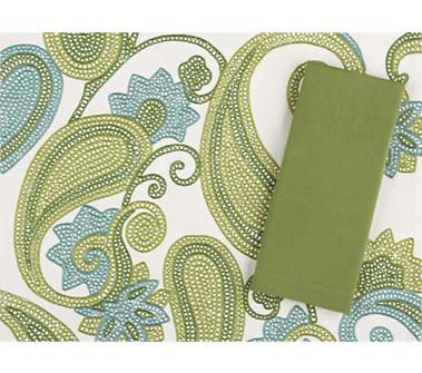


(this fabric would also be great in Turquoise & White)
3. Lighting - I would recommend barrel shade pendant lights for over the sink and dining table. This is a very popular look right now and will introduce another texture into the space. I looked at glass pendants, but I think you should keep these neutral and with lots of texture, since lighting is an investment and your tastes may change over the years. Also, you have many hard angles and rectangle shapes in the kitchen, so introducing a curved shape will help soften the room.
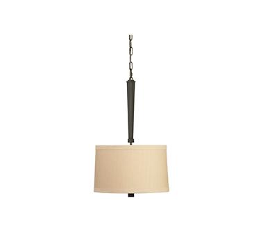
(For over the sink. Has a neutral linen barrel shade)
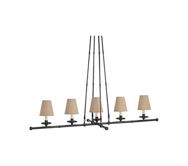
(For over the dining table. Has neutral linen shades)
4. Accessories -
Find containers in turquoise, lime & navy to group on top of the upper cabinets. Be sure to vary the textures and group in 3's and 5's. Keep it simple. A little goes a long way.
Introduce rattan texture in chargers (to dress up your white dinnerware in a placesetting) and a tiered stand to place on the island. This will also tie back to the natural linen shades in your lighting and woven shades (if you go that route)
Introduce glass texture in apothecary jars (see inspiration board for photo) that can serve as canisters (holding flour, sugar, etc) or as a decorative element, holding fake granny smith apples (tying back to your wall paint). Again group these in 3's or 5's. These can be placed on any of your countertops.
Find a rug that incorporates 2 or 3 of the colors - Example shown on the board has the apple green & turquoise colors.
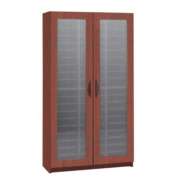
5. Storage - Find a tall storage piece with solid doors (to hold pots, pans, etc.) for the half wall that backs to the mud room. The key with this piece is height! You have tall ceilings here, so maximize your storage space vertically. Remember, you don't have to look specifically for a kitchen storage piece. Look in living room and media storage for pieces that may work. Some examples:

The dark grain in the wood panels will blend nicely with your cabinets when they are stained. I like that it is very clean lined and a unique "statement" piece.
Frosted glass doors could work as well.
6. Wall Decor - I would move the spoon pieces to above the tall unit on the half wall and hang as a collection. For the feature walls on either side of the window, I would introduce some fun art. I really like the "vintage" and slightly "whimsical" looks in the kitchen. Also, remember art doesn't have to be matchy-matchy with your colors. You want it to pop and you want it to be a statement piece. I pulled some examples but if you go to www.art.com and click on vintage there are many to look at. I know you guys travel; they have some really great travel posters in the vintage category as well. Some examples:


This is the piece I put in the collage. I love it. The artist is Rodney White and he does quotes, but in a very tasteful way. This one reads, "It'll cost nothing to dream & everything not to."

Another Rodney White piece.
"Rain is good for growth. Shine is good for blossoming."

"Your future is just as you've imagined."

"Life is always in progress."
7. Window treatments - Keep it simple. No fussy windows in the kitchen. I would go with roman shades in a neutral color or bamboo shades. Some examples:


These are cloth Roman shades. You could do them in white, ivory or a natural color. Also, burlap would look great too! These are the shades I was telling you about that I am going to make using my 2" wood blinds as the frame. I will let you know how they turn out!

If you want to jazz up roman shades, you could do a neutral shade like this one and trim it in navy or turquoise 2" grosgrain ribbon.
8. Other ideas -
I love the idea of doing open shelves in the pass through window by your dining table. You could do wood tone to match your cabinets or white, to match the moulding in the living room. Remember when accessorizing to choose 1 - 2 of your colors and use only those. Otherwise it will look "junked up" So, you could do lime & turquoise or lime & navy or turquoise & navy - accessorize with containers, candles, books, etc.
I would use the counter space to the right of the entry to the mudroom to set up a baking center. Place your navy kitchen aid mixer here and store all your baking pans, etc in the cabinets in this unit. A baking cookbook on an iron stand would be a nice touch as well.
Okay, that's it for now! Coming soon -- staining kitchen cabinets (how to's, tips, products) and inspiration boards and suggestions for the living room and foyer! I'm also emailing pictures that I took inside your kitchen, marked up with notes on the suggestions above.


I really like those colors. Do you think I could convince my fiance to do those (instead of pink and blue)? I am just not a pink kind of guy, and we haven't had our Houston printers print off our invitations yet, so there is still time...
ReplyDelete